Windows 10 isn’t just a big change for Windows 7 users. There have been some major changes in philosophy since Windows 8. Windows 10’s touch interface is now very different and more integrated with the desktop.
Whether you’ve been using Windows 8 on a desktop PC, on a tablet, or on a “two-in-one” device, you’ll find a lot of changes. Tablet users will see the biggest changes.
Windows 10 Restores Sanity for Desktop Users
Windows 10 continues a pattern of Microsoft retreating from the original vision of Windows 8. Where Windows 8 forced you to boot to the Start screen and eliminated the Start button, Windows 8.1 added boot-to-desktop functionality and Start button. Windows 8.1 Update added even more mouse-based controls.
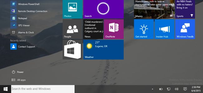
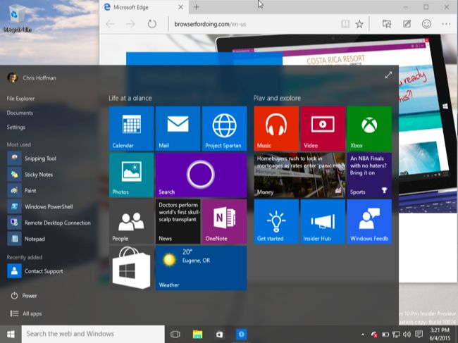
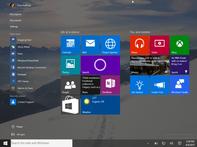
Windows 10 goes further, restoring the pop-up Start menu for desktop users. The charms bar and “app switcher” hot corners are eliminated. All those new “universal apps,” called “Metro apps,” “Modern apps,” or “Store apps” in Windows 8, now run in windows on the desktop. They can be controlled and used just like normal desktop applications. There’s a “tablet mode” optimized for touch devices, but Windows 10 never forces you into this mode on a desktop PC. Touchpad gestures have been rethought, so you won’t end up seeing the charms after accidentally sliding your finger of the right side of the touchpad. Rather than two different versions of Internet Explorer, there’s now a single browser named “Microsoft Edge.”
You no longer need to jump through all those hoops to enable boot to desktop or install a third-party Start menu, nor do you need to disable those obnoxious mouse-based hot corners. You also don’t need to change the default apps to different image and PDF viewers — those new-style applications will now open in windows on the desktop rather than ripping you away to another interface. If you’re used to a desktop interface, Windows 10 will seem much more natural than Windows 8.

Improvements for Desktop Users
Windows 10 offers significant improvements for desktop users over Windows 8, too. The Task View feature finally brings integrated virtual desktops to Windows, giving Windows users what Linux and Mac users have had for a long time. Even if you don’t want to use virtual desktops, this provides an Exposé-like interface that displays all your open Windows.
Other changes even include enhancements to the Command Prompt. There’s integrated Game DVR functionality for recording and streaming PC gameplay, DirectX 12 technology. Enhancements to Snap allow you to snap desktop windows in a 2×2 grid and more quickly snap windows.
The integration of the new “universal apps” into the desktop means you might actually want to use them alongside your traditional Windows desktop programs. Time will tell just how many people will care about these.

OneDrive Changes
If you’ve gotten used to the way OneDrive works in Windows 8.1, you might be disappointed. Rather than downloading all the files in your cloud storage, OneDrive on Windows 8.1 displayed “placeholder” files. They’d be automatically downloaded when you access them with a program in Windows or try to open them. You could also choose to make some files available offline ahead of time.
Microsoft changed things in Windows 10. OneDrive will work just how it did on Windows 7. Like with competing services like Dropbox and Google Drive, placeholder files are no more. You’ll have to choose what to sync ahead of time. Microsoft said they did this because the placeholder files in Windows 8.1 were buggy and incompatible with some Windows desktop programs.

The Redesigned Touch Interface
Touch users will have the biggest shock with Windows 10. Familiar interface elements like the charms bar and app switcher are now completely gone. Rather than a new-style “Modern” interface and a desktop that sit alongside each other, everything is integrated into a single interface.
The old “Modern” app switcher is no longer there. Swipe in from the left on a tablet and you’ll see the same Task View interface desktop users see, which will allow you to choose an open window. Microsoft is using the same interface in both places, rather than offer two different application switchers, as it did on Windows 8.

The charms bar is also gone. Swipe in from the right and you’ll see the notification center, which helpfully provides some shortcuts to common settings at the bottom of the notifications.

As the charms bar is gone, universal apps no longer rely on it for their search, sharing, or settings functionality. New-style universal apps have integrated “Search,” “Share,” and “Settings” buttons built into their interface if they need them, just as on Android and iOS. “App bars” full of hidden settings are also gone, largely replaced by “hamburger menus” that appear at the top-left corner of applications.

There is still a special “Tablet Mode” that makes the user interface more ideal for touch-based tablets. On tablets without mice and keyboards, this will be enabled automatically. On 2-in-1 devices, this mode will automatically be enabled when you unplug your device’s keyboard thanks to “Continuum.” You can also choose to manually toggle Tablet Mode on and off from the setting shortcut at the bottom of the notification center.
Enable Tablet Mode and you’ll have a more Windows 8-style interface. The Start button now brings up a fullscreen version of the Start menu. Apps you open will open in full-screen mode — even traditional desktop applications — and you can swipe down from the top to snap them to either side of your screen, just as on Windows 8.
Unlike on Windows 8, the taskbar does stick around. But it goes into a super lightweight mode without any application icons on it by default, and it will have a global back button — like on Android.

Windows 10 is a course correction after Windows 8, and it is much more at home on a desktop PC. Tablet and touch device users will find an interface that works differently, but it does make a lot more sense when switching between touch and mouse-and-keyboard mode on 2-in-1 PCs.
EmoticonEmoticon